
The word “MODO” is designed in a bold, geometric sans-serif style with subtle breaks in the circular forms, giving it a technical and contemporary feel. This creates a sense of precision and structure, often associated with architectural and design studios.
Below it, “DESIGNS” is set in a lighter, widely spaced typeface, balancing the heavier top wordmark. Thin horizontal lines extend outward on both sides, reinforcing symmetry and adding a refined editorial touch.
The overall composition is centered, minimal, and monochromatic, emphasizing clarity, professionalism, and modern design sensibility—well suited for an architecture or interior design brand.
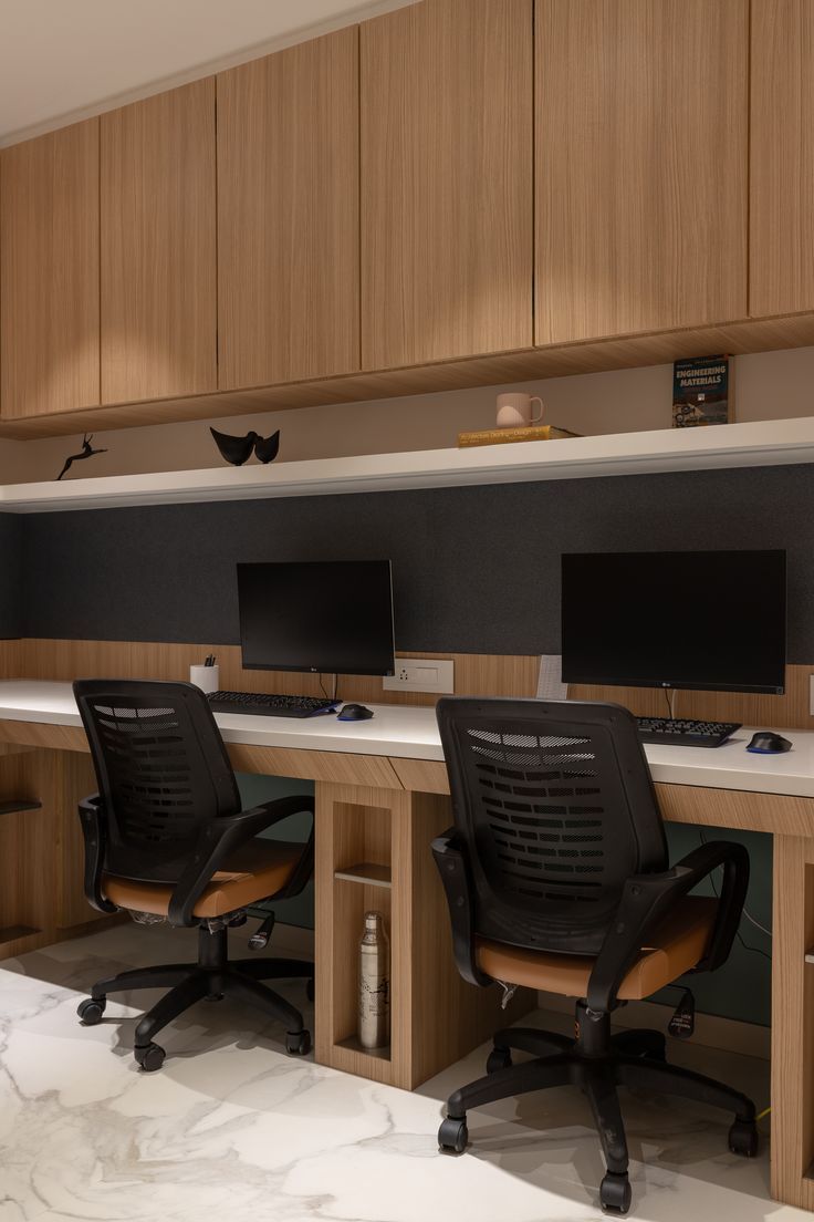
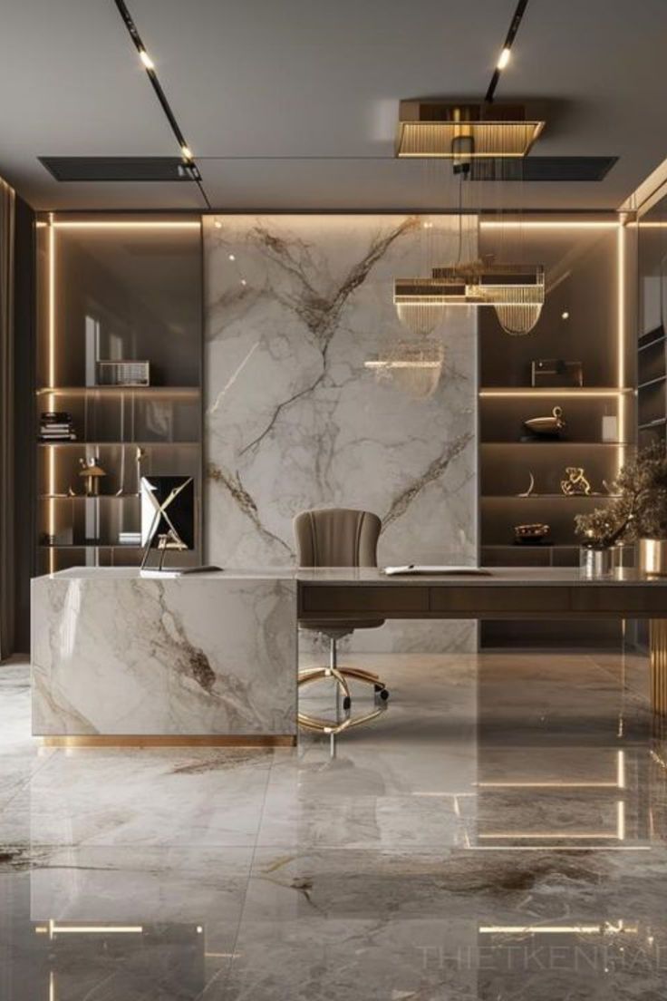
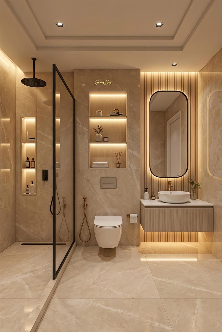
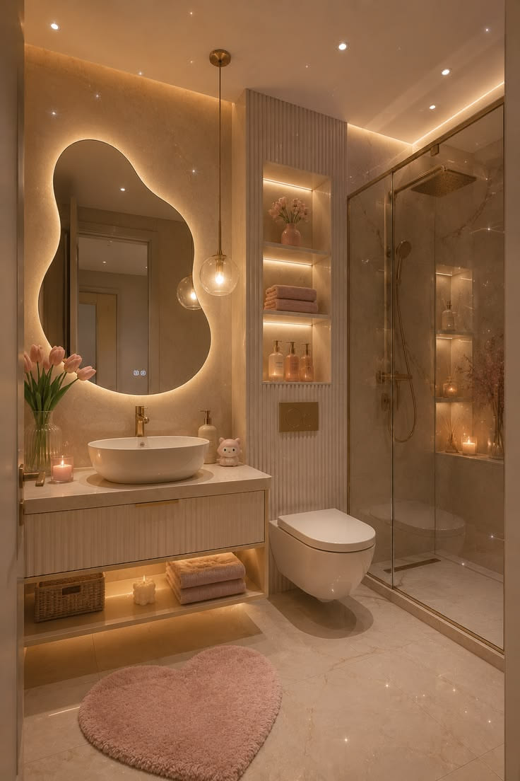
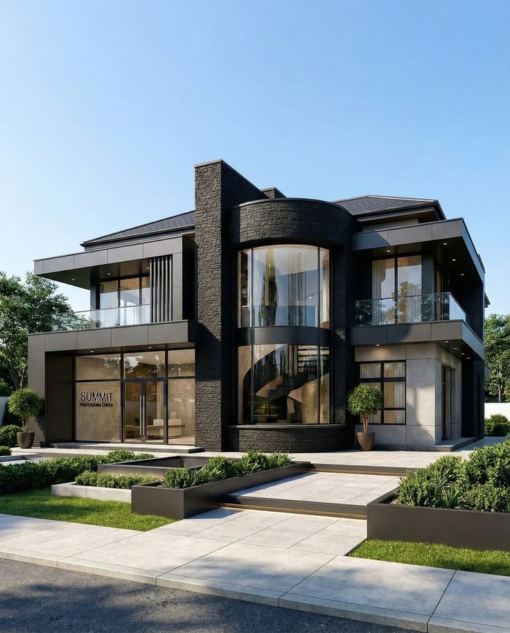
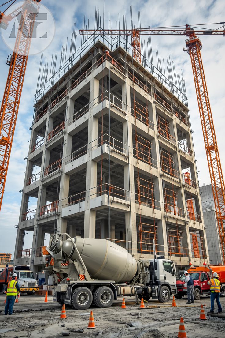
Our vision is to provide innovative, independent project solutions
that solve problems for homes, industries, and workspaces, as we would like in
our own residences, work spaces.